
Guest post by Josh Coates. Josh studied Computer Science at the University of California, Berkeley and is the Executive Director of the B. H. Roberts Foundation.
A recent report boldly declares that the “Devout No Longer Define Mormonism. Devout Traditionalists, once two-thirds of the LDS population, are now a minority” based on the Pew Religious Landscape Survey data. However, replicating the analysis on the public RLS data reveals that these claims fail statistical validity tests.
The phenomenon known as pareidolia is when we see patterns in things that aren’t really there. We see what looks like a face on the surface of mars [1] or a rabbit on the moon, or I’m told by a reliable source that there is a large boulder outside of Delta, Utah that resembles Joseph Smith. [2] This is a very human experience [3] – we have some innate desire to understand the world around us and this desire can be so strong that it overrides our ability to discern reality.

Such is the case when working with sociological data. We want to understand human nature, and the answers are somewhere in the data, if we can only find them. Sometimes there are answers there, often, more questions – but how do we avoid seeing patterns in the noise that aren’t really there? How can we tell the difference between signal and noise?
Statisticians have a robust set of statistical tools and standards that help us know when we are attempting to squeeze the data into something that isn’t actually there. Each tool has a different way of helping the user determine if the pattern is “real” or not – if it falls into an accepted range, it’s considered strong, if it’s just outside the range, then it could be valid, but is considered difficult to support without additional evidence, and if it falls far outside the range, then it’s bunk.
In social science, insight can be provided when we group populations into clusters of ‘types’ of people based on their politics, finances, social class, consumer behavior, religious beliefs, or their family relationships. Recently, a paper was posted by Alex Bass, the author of the Mormon Metrics substack entitled “Mormon Typology Report”, which claimed to have discovered four statistically distinct types of Latter-day Saints within the data of the Pew Religious Landscape Survey (RLS). Bass named the four types Devout Traditionalists, Adaptive Believers, Cultural Mormons, and In-Betweeners.
Undoubtedly there are people we know in our wards that we can imagine fitting into these labels- and perhaps there may be some useful insight gained for understanding our ward families in these terms. The problem is that statistically speaking, these types do not appear to exist in the Pew data. There is nothing you can say about whether Devout Traditionalists are on the rise or on the decline or whether Cultural Mormons are less or more educated than Adaptive Believers, or if In-Betweeners are more or less happy than Devout Traditionalists because with so few data points in the relatively tiny amount of Latter-day Saint respondents in the Pew RLS data set, any apparent differences are indistinguishable from sampling noise. By the accepted statistical measurements, the groups aren’t in the data – they are products of pareidolia – meaningless patterns in the noise.
But Pew is a statistical powerhouse and a reliable institution for social science – why would they have bad data? Well, they don’t. Their data is good data – the problem is, there just aren’t very many of us. Latter-day Saints make up less than 2% of the population in the US, and when conducting a national survey, there just aren’t that many Latter-day Saints that show up in the data. Each time Pew conducted the RLS (in 2007, 2014 and 2024) they typically only ended up with 500-600 self-identified Latter-day Saints. Statistically speaking, that’s a reasonable amount of data if you want to get a general idea of what portion of Latter-day Saints believe in God, compared to what portion has doubts – or what portion leans conservative and what portion leans liberal.
However, in this case, when the data is clustered into groups, the cluster sample sizes become tiny, leaving margins of error so wide that trend or subgroup comparisons aren’t statistically reliable. For example, in the Mormon Typology Report, one of the clustering groups was based on just a couple of dozens of survey respondents. And, intuitively, it seems off base to claim that one of four ‘types’ of millions of Mormons is only supported by the way a few dozen people responded to a survey, doesn’t it?
But we don’t have to rely on our intuition, which is often prone to error. Instead we can utilize the standard statistical clustering tools and see what’s real and what’s imagined in the data. [4] So before we ask ourselves which group is happier, which one is more educated, which one believes what about evolution – let’s ask if these groups, in a statistical sense, based on the Pew data, even exist at all.
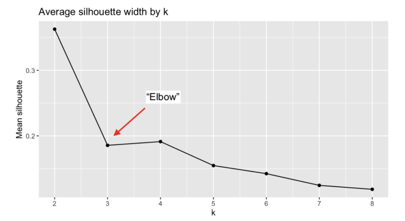
One of the most basic clustering tests to determine groupings in data is the “elbow” test. [5] This test asks, “given this set of data, are there a natural number of clusters?” In the case of the Latter-day Saint Pew data, given the number of respondents to these particular questions about beliefs and demographics, how many groups (if any) are naturally forming up?
The normal response to the “elbow” test is to note the number of clusters that the data naturally falls into that are just to the left of the “elbow,” and if it reaches a minimum threshold, then it is probably a valid grouping of the data. In this case, two clusters, or two groups of Latter-day Saints are to the left of the elbow; except our mean silhouette is only just over 0.35 which means that this data can’t even support two groupings very well (more on that later). These results also show that picking three or four clusters is a bad idea because further tests will likely reveal that these aren’t real statistical groups. The author of the Mormon Typology Report picked four groups and all the graphs and analysis in the report are based on this decision.
So after we decide how many clusters we think are supportable, we can check if we made a good decision by using a Silhouette test. [6] This test measures the “width” of a cluster, and to put it simply, if it’s too skinny, then it means that the cluster isn’t real – it’s just noise in the data.
Here are the results of the Silhouette test of the four Mormon Typology clusters:
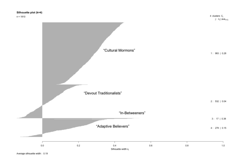
This is somewhat difficult to read, but the important numbers are the widths. The widths of each of the clusters are 0.28, 0.04, 0.38, and 0.15 with a weighted average width of all four of 0.19.
The standard acceptable minimum width of what is considered a valid cluster is 0.25, which even then, is considered “weak” support for a cluster. Ideally, you would want data that could support something above 0.5 or higher.
Now if we had good results, we may want to perform a Jaccard stability test on our clusters. [7] A Jaccard stability test tells us if our clusters are “stable” or not by comparing them to slightly different versions of the data to see if they end up clustering in a similar way. If they are stable, then that means that we’ve found a stable pattern in our data. If not, then it’s more likely our clustering is forced or arbitrary. The Jaccard index scores of each of the cluster configurations are above 0.75 which indicates that our clusters are relatively stable.
So in the case of the RLS data, because our silhouette test is well below the threshold to support four clusters, using the Jaccard index to test stability indicates that we have robustly reproducible artifacts of noise, not a finding of statistically valid groups.
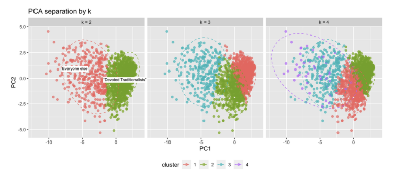
The claim that four types of Latter-day Saints are distinct in the Pew data isn’t supportable. And given the limited size of the data set, even saying there are two types in this data is somewhat questionable. There just aren’t enough survey respondents in this data set to support a robustgrouping. The numbers are telling us that these groupings are simply a case of pareidolia. You can add colors and circle data points and create as many groups as you’d like (see graph below), but our statistical tools are telling us that these are figments of our imagination in this data. What this means is that saying one group is in decline, or another group is more educated, or another group is happier is nonsense.
This write-up is primarily about using accepted statistical methodology to double check our work before making claims based on small data sets of a religious minority like the Latter-day Saints. The reason this is important, is because when adhering to statistical rigor is dismissed claims may be made which are simply not supported by the available data. The following statements are just a small example of bold claims contained in the Mormon Typology Report that may make great headlines for a blog, or a soundbite for an article, but are simply unsupported by the Pew RLS data:
“What was once a faith defined by overwhelming uniformity — where the majority of members could be described as devout, orthodox, and politically conservative — has fractured into a more complex spectrum of identities.”
“The Devout core of Mormonism has shifted from female-majority to male-majority.”
“The Republican coalition among Mormons is strong on paper — but beneath the surface, it is fractured.”
“Devout Traditionalists continue to ground morality in religion, while Cultural Mormons and In-Betweeners rely more on science and reason.”
Anyone interested in Latter-day Saints would love to have an adequate sample size to better understand beliefs, practices, groupings, and trends of this religious population. Perhaps with a large set of Latter-day Saint data there could be reasonable support to make bold claims about the present and future direction of this religious minority, but until then researchers must be careful and cautious in the claims they make on behalf of the small data samples. Let’s push the data as far as the accepted standards of statistical rigor will allow, but not further, or we’ll end up announcing we’ve found signs of intelligent life on mars when it’s really just a pile of rocks.
[1] Photographed by the Viking 1 space probe in 1976, the “face on mars” feature is more properly known as the Cydonia mesa, which it turns out, is just a bunch of dirt and rocks.
[2] The reliable source was my missionary companion in 1993 who was from Delta, Utah. ;-)
[3] Apparently there is some evidence that Rhesus monkeys (Taubert 2007), chimpanzees (Tomonaga 2023) and possibly dogs (Cuaya 2015) experience some form of pareidolia as well.
[4] The author of the Mormon Typology Report was gracious enough to post a significant portion of his code on github (https://gist.github.com/acbass49/9fbe99f97e64f26df10c83cbbe5880b9) and the Pew Religious Landscape data is available to the public. I downloaded the data sets, and downloaded the github code and simply added some basic validity tests to it in order to measure the strength of the clusters. The relevant code is available here: https://github.com/joshbhroberts/mormontypologyclustercode/
[5] This test is not sufficient by itself, but it’s a good first test to see the shape of the data and decide what you are working with. See https://en.wikipedia.org/wiki/Elbow_method_%28clustering%29
[6] Silhouette analysis is a more recent development, proposed by Peter Rousseeuw in 1987. See https://en.wikipedia.org/wiki/Silhouette_(clustering)
[7] Developed by Grove Karl Gilbert, and later developed independently by Paul Jaccard in the 19th century. See https://en.wikipedia.org/wiki/Jaccard_index
Comments
9 responses to “Manufacturing Mormon Types from Noise: A Statistical Reality Check on Clustering Claims in Religious Survey Data”
Thanks, Josh
Really interesting. Thanks.
I like the pictures
This isn’t an area of statistics I work in and the quick intros to cluster analysis I’ve sat through didn’t cover diagnostics, so it’s very interesting to see them done.
I wish you’d given us a plot with k=1, as I’m not sure my “Yeah, that might be two clusters” impression would survive seeing them all in one color. I definitely don’t see four. I appreciate your comment that the primary purpose of sophisticated statistics it to tell if something we see is real or not–you really want to start with something you can see! It’s possible for sophisticated statistics to unmask something that isn’t obvious, but it’s rare. A mistake I frequently see grad students make is to jump to the most sophisticated statistics they know, then, when they don’t find what they expected, assume, with some reason, that they must being doing the statistics wrong. So they try a bunch of different models and specifications hoping to get what they expected, not realizing that their well-intentioned attempts to do the statistics right are basically p-hacking. If they come to me, we’ll do some scatterplots or compare means between groups or something similarly simple, and then it often becomes obvious why their fancy model wasn’t finding anything. Stephen C’s recent post on women’s well-being was a good example of starting with statistics that are basic and robust.
All that said, big kudos to Alex Bass for making his code reproducible and public. Mistakes will happen, but reproducibility and transparency is what lets us correct them.
I second the big kudos to Alex for transparency. Like I’ve said before (https://timesandseasons.org/index.php/2025/08/plausibility-structures-intellectuals-and-the-churchs-truth-claims/), I like his stuff.
Josh, thanks for helping us all understand the data and their inference boundaries. I don’t understand why Alex could not have done what you did. I hope he points people to your article.
thanks for the thanks all, and yes, kudos to alex for making his code available and his work reproducible and being willing to kick off a discussion like this.
and i’m glad you liked the pictures meagan. ;-)
Statistics was made for man, not man for statistics. (I’ve always wanted to say that.)
Yes, it would be better if we had more data. But rather than disregard or brush of Alex’s work, let’s take it as an interesting hypothesis and see if future learnings corroborate or nullify these findings.
Thanks for bringing some nuance to the discussion. Still, I wouldn’t disregard the findings from the Mormon Typology Report because the groupings did not meet X level of rigor. There is a difference in claiming that (1) there are subgroups that tend to have different sets of beliefs/characteristics and (2) this is the boundary between subgroups A and B, and no one can convince me otherwise. We can appreciate that the findings can be helpful in revealing some broader trends.
A note about the scatter plots (PC1 vs PC2) for other readers. These data are shown in just two axes, whereas the data actually contain several other dimensions that aren’t plotted here. So when it looks like the purple group in k-4 overlaps with two other groups, keep in mind that it does not overlap in other dimensions.